Painting vs Wallpaper: Pros and Cons
August 28, 2023
How to Select Durable Paints for High-Traffic Areas in Commercial Spaces
October 23, 2023Choosing the Right Paint Colors for Commercial Spaces

Choosing the Right Paint Colors for Commercial Spaces
Choosing the Right Paint Colors for Commercial Spaces. The choice of paint colors deeply influences the atmosphere and functionality of commercial spaces.
In interior design, color psychology is pivotal in creating environments that cater to aesthetics and purpose.
This comprehensive guide will explore how selecting the right paint colors can transform commercial spaces, elevating their impact on employees, customers, and the brand itself.
Understanding the Purpose of the Space
Considering the Intended Use
Before reaching for the paintbrush, it’s crucial to understand the intended use of the commercial space.
Is it an office where productivity is paramount, a retail store aiming to attract customers, or a healthcare facility focused on patient comfort?
Each purpose requires a different approach to color selection.
The Influence of Color
Color isn’t just about aesthetics; it profoundly impacts how people feel and behave.
For example, blues and greens can enhance productivity and creativity in office spaces, while warm tones like red stimulate appetite and encourage impulse buying in retail environments.
Understanding these effects is key to creating the desired experience.
The Role of Branding and Corporate Identity
For many businesses, branding is everything. The colors associated with a brand are an essential part of its identity.
When selecting paint colors, it’s essential to harmonize with the brand’s palette while ensuring it aligns with the desired atmosphere of the space.
Color Psychology in Commercial Design
Different colors evoke different emotions and responses.
- Blue, often associated with calm and trust, can be ideal for professional settings.
- Green symbolizes growth and can work well in creative spaces.
- On the other hand, red can create a sense of urgency and excitement, making it suitable for retail environments.
Impact on Mood, Behavior, and Perception
Colors influence not only mood but also behavior and perception.
Warm colors can create a sense of warmth and urgency, while cooler tones like blue and green evoke calmness and trust.
Understanding these nuances allows for intentional design.
Creating the Desired Emotional Response
In commercial spaces, the emotional response of visitors is paramount.
For instance, a spa might use soft, soothing colors to promote relaxation, while a fitness center may opt for energetic, motivating tones.
Color choice becomes a powerful tool for crafting these emotional responses.
The Importance of Lighting
Lighting’s Effect on Color Perception
Lighting is a silent partner in the world of color. The same paint color can appear vastly different under various lighting conditions.
It’s essential to consider both natural and artificial lighting when choosing paint colors.
Balancing Natural and Artificial Lighting
The ideal balance between natural and artificial lighting can accentuate the chosen color palette.
Maximizing natural light can create a vibrant atmosphere, while strategic use of artificial lighting can enhance mood and functionality.
Using Lighting to Enhance Color
Sophisticated lighting design can complement paint choices.
Dimmable lights, for example, allow for flexibility in setting the desired ambiance, whether it’s bright and energetic or warm and cozy.
Choosing a Neutral Base
The Role of Neutral Colors
Neutral colors provide a versatile and timeless base for commercial spaces. Whites, grays, and beiges can serve as a backdrop that allows other elements, such as furniture and decor, to shine.
Options and Versatility
Neutral colors come in various shades and undertones, offering flexibility in design. Cool grays can convey a modern, sleek look, while warm beiges can create a cozy, inviting atmosphere.
Incorporating Neutrals
Using neutrals as a foundation doesn’t mean sacrificing creativity. Bold accent walls or colorful furnishings can stand out against a neutral backdrop, creating visual interest.
Injecting Brand Identity
Incorporating Brand Colors
For businesses, brand identity is often non-negotiable. Incorporating brand colors into the commercial space reinforces brand recognition and cohesion.
Balancing Brand and Design
Balancing brand identity with practical design considerations can be a challenge.
However, a thoughtful approach can integrate brand colors seamlessly into the space, enhancing aesthetics and alignment.
Creating a Welcoming Reception Area

Significance of the Reception Area
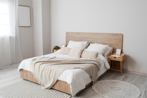
The reception area is the first impression visitors have of a commercial space. Warm and inviting colors can make clients and customers feel welcome and at ease.
Warm and Inviting Colors
Colors like soft blues, warm yellows, and earthy greens can create a welcoming ambiance in reception areas. Accents like artwork and comfortable seating further enhance the atmosphere.
Using Accents for Impact
Accents like colorful artwork or strategically placed plants can make a lasting impression in reception areas. These details can convey professionalism and attention to detail.
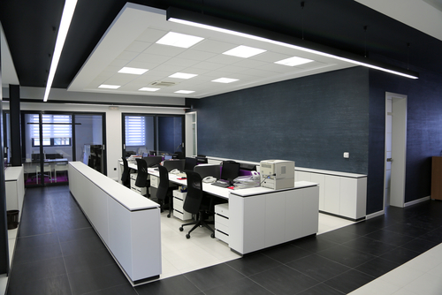
Employee Productivity and Wellbeing
Productivity-Promoting Colors
In office spaces, the right colors can boost employee productivity and focus.
Neutral tones like gray and beige create a calm, focused atmosphere, while pops of color in common areas can stimulate creativity.
Comfortable and Inspiring Environments
Employee wellbeing is a top priority. Consider incorporating biophilic design elements, such as natural greens and earthy browns, to connect employees with nature and enhance their comfort.
Biophilic Design for Wellbeing
Biophilic design principles, including natural materials and colors inspired by nature, can create a healthier and more inspiring workplace. This approach can reduce stress and increase job satisfaction.
Customer Experience and Retail Spaces
Influence of Color on Shopping Behavior
Retailers have long recognized the power of color in influencing shopping behavior. Warm colors like red and orange can create a sense of urgency, encouraging impulse buying.
Cohesive and Appealing Color Schemes
In retail environments, a cohesive color scheme is key. Colors should guide customer flow, highlight products, and create a harmonious shopping experience.
Guiding Customer Flow
Strategic use of color can direct customer attention to specific areas, such as sale displays or new arrivals. This influences buying decisions and enhances the overall shopping experience.
Restaurant and Dining Spaces
Role of Color in Restaurant Ambiance
In dining establishments, color is vital in creating the desired ambiance. Warm, earthy tones create a cozy atmosphere, while vibrant colors convey energy and excitement.
Enhancing Appetite and Comfort
Certain colors, like red and yellow, are known to enhance appetite. Incorporating these hues into restaurant design can encourage diners to savor their meals.
Creating Themed Atmospheres
Restaurants often have themes that evoke a seaside escape, a rustic farmhouse, or a chic urban bistro. Colors are instrumental in bringing these themes to life.
Healthcare and Healing Environments
Color Considerations in Healthcare
Healthcare settings require careful color consideration. Soothing and calming colors, such as soft blues and greens, can promote patient comfort and relaxation.
Designing for Healing
Designing healthcare spaces that promote healing and reduce stress is a growing trend. Color choices play a pivotal role in creating environments that support patient wellbeing.
Incorporating Nature and Tranquility
Incorporating elements of nature, such as calming blues and greens, can create a tranquil atmosphere in healthcare settings. This contributes to a sense of healing and comfort.
Hospitality and Hotel Spaces
Conveying Luxury and Comfort
Hotels aim to create a sense of luxury, comfort, and relaxation. Color choices, from soothing neutrals to opulent jewel tones, contribute to this ambiance.
Psychology of Hotel Room Colors
The colors used in hotel rooms are carefully chosen to influence guest satisfaction. Calm and soothing colors promote restful sleep, while vibrant accents create visual interest.
Regional and Thematic Palettes
Some hotels draw inspiration from their location or theme. Coastal resorts may feature ocean blues and sandy beiges, while urban hotels may embrace sleek grays and metallic accents.
Paint Finish and Durability

Selecting the Right Paint Finish
The choice of paint finish is not just about aesthetics but also durability and maintenance.
High-traffic areas may require a more durable finish, while elegant spaces can benefit from a matte or satin sheen.
Factors Affecting Durability
Factors like foot traffic, cleaning frequency, and exposure to moisture can impact paint durability. Understanding these factors is crucial when choosing a finish.
Balancing Aesthetics and Practicality
While aesthetics are vital, practicality should not be overlooked. Consider how the paint finish will perform in the long run and whether it can withstand the demands of the space.
Testing and Sampling Colors
Importance of Sampling
Never underestimate the importance of sampling paint colors in commercial settings. Lighting conditions and surrounding elements can significantly affect color perception.
Minimizing Color Dissatisfaction
Sampling allows you to see how colors will look in the actual space. It minimizes the risk of color dissatisfaction and ensures that the chosen colors achieve the desired effect.
Budget Considerations
Balancing Budget Constraints
Budget constraints are a reality for most businesses. However, even with limited resources, achieving the desired color effects through careful planning and strategic choices is possible.
Long-Term Value
Investing in durable and appealing paint finishes may require an initial outlay, but it often pays off in the long term. Quality paints can last longer, reducing the need for frequent repainting.
Cost-Effective Strategies
There are cost-effective strategies for achieving desired color effects. Using neutrals as a base and incorporating strategic accents can create a stunning look without breaking the bank.
Choosing the Right Paint Colors for Commercial Spaces – Conclusion

Business owners and designers alike are encouraged to approach color selection thoughtfully.
By doing so, they can enhance the functionality and aesthetics of their commercial spaces, creating environments that resonate with employees, customers, and visitors alike.
In commercial design, the right paint colors are more than a visual choice; they are a strategic decision that can elevate a space from ordinary to extraordinary.
Are you seeking professional and reliable painting services in Singapore? Contact us today!


